This post was originally written as an assignment for INFO 2450: Communication & Technology taught by Professors Jeff Hancock and Drew Margolin in Fall 2013. The course focuses heavily on design of technologies. The assignment asked for an evaluation of an online application or product based on the principles outlined in Donald Norman's "The Design of Everyday Things". It's a very basic look at the technology, but I thought I'd share it anyhow.
App.net is a social platform designed from the beginning to be nothing more than a platform for developers to build great social apps upon. This blog post will be about the very first application built upon App.net, called Alpha. App.net will henceforth be referred to as "ADN."
The main purpose of Alpha is to demonstrate the ADN API in a somewhat familiar way. Alpha behaves much the way Twitter does: a user creates posts, users can follow other users and interact with them in the familiar way. The divergence from Twitter (and other "microblogging" social applications) is twofold: a user pays for his or her account, and the posts may be longer.
By asking the user to pay for an ADN account (which is used by Alpha as the poster's identity), the normal business incentives shift from building an application (or platform) which optimizes for advertisement revenue to an application (or platform) which optimizes for the happiness of the user (if users like to use the service, they will continue to pay the $5/month or $32/year). Twitter, Facebook, and Google are well-known for accepting user detriment (in terms of the virtual design of the products) for greater advertisement revenue. This is not the case with ADN (and by extension, with Alpha).
On Alpha, posts may be up to 256 characters long and users can choose to attach media to their posts. The "@" symbol is used to mention another user (the other user receives a notification when this happens) and the "#" is used to denote topics. With the longer character limit, one could easily surmise that Alpha is attempting to make having asynchronous, open conversations online a bit easier. The openness of being able to write anyone (divergence from Facebook) coupled with the 256 character limit (a physical constraint) (divergence from Facebook, and extension of Twitter's idea that a post should be "bite-sized") produce a fantastic application for having chats with anyone about anything in a way conducive to conciseness and to expressiveness. One common frustration with Twitter is that conversations on it are very challenging, as 140 characters is far too few to really say anything substantive. ADN hopes to remedy this problem, and in my experience, arguments (and general discussions, for that matter) have been incredibly easy and productive.
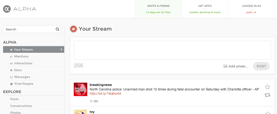
Above, you see the home screen of Alpha (namely, mine). This shows the user's stream. The search box and post box (based on their physical attributes) afford writing. The change of the "POST" button from grey to a nice deep red-orange highlights a change of the mapping from a button that may not be pressed to one that may be pressed (I would consider the change itself feedback). As the user types in a post, the number (shown here as "256") decreases by one for each character that is typed into the box above it, providing very valuable feedback about the user's actions. This number's presence also provides visibility for the physical constraint placed on the size of the posts allowed in the service. The buttons on the right of each post afford clicking and change color (feedback) when clicked. All of the aforementioned design elements, in addition to the placement of the post box at the top, suggest that the application is trying to get the user to submit content to his or her stream. The feed below seems to indicate that the application wishes for perusal and interaction of other users' posts by the logged-in user.
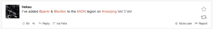
As you saw above, each post is given its own box. There are 5 interactions which only show up when the user mouses-over the post: "Discussion," "Reply," "via (app)," "Mute User," and "Report". In order to better facilitate the app's goal of interaction, it would make sense for the "Discussion" and "Reply" buttons to always be shown. This would improve the visibility of the interaction paradigms and afford interaction without the user making the first move (to mouseover).
That's it.